
It is now available as an app for iOS and Android.
It works perfectly in landscape or portrait format on your device, and has all the same features as the desktop / web browser version.
It is now available as an app for iOS and Android.
It works perfectly in landscape or portrait format on your device, and has all the same features as the desktop / web browser version.
A site with map quizzes. Suitable for KS1 and 2 pupils.
The focus is on learning the geography of Europe.

Thanks to Hannah Steel for the link to this useful visualisation tool.
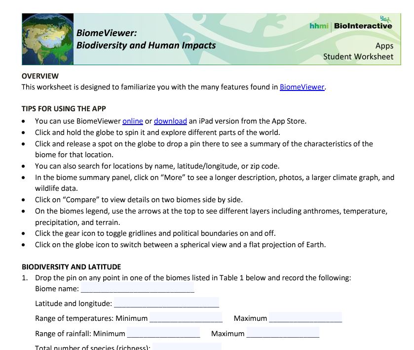
Biomeviewer displays a range of information in a visual way.

It's really useful for identifying biomes in a general way, and rotating the globe to see where they are located and identifying their characteristics.
There are accompanying resources in a folder, student worksheet and apparently an iOS app too.
The worksheet takes students through the various features which are built into the app.
You can also explore anthromes: anthropogenic biomes. These are where the majority of humanity lives.
A classification proposed by E.C. Ellis, October 25, 2005 lists them. Minimum mapping scale greater than or equal to one square kilometer.
I'm starting to explore a few AI related avenues for a project I'm going to be involved in for the next few months.
I'm interested in the ethics of using AI when teaching geographical topics, and the implications for students' understanding of the world if they are exposed to images, text and other information which have been AI generated.
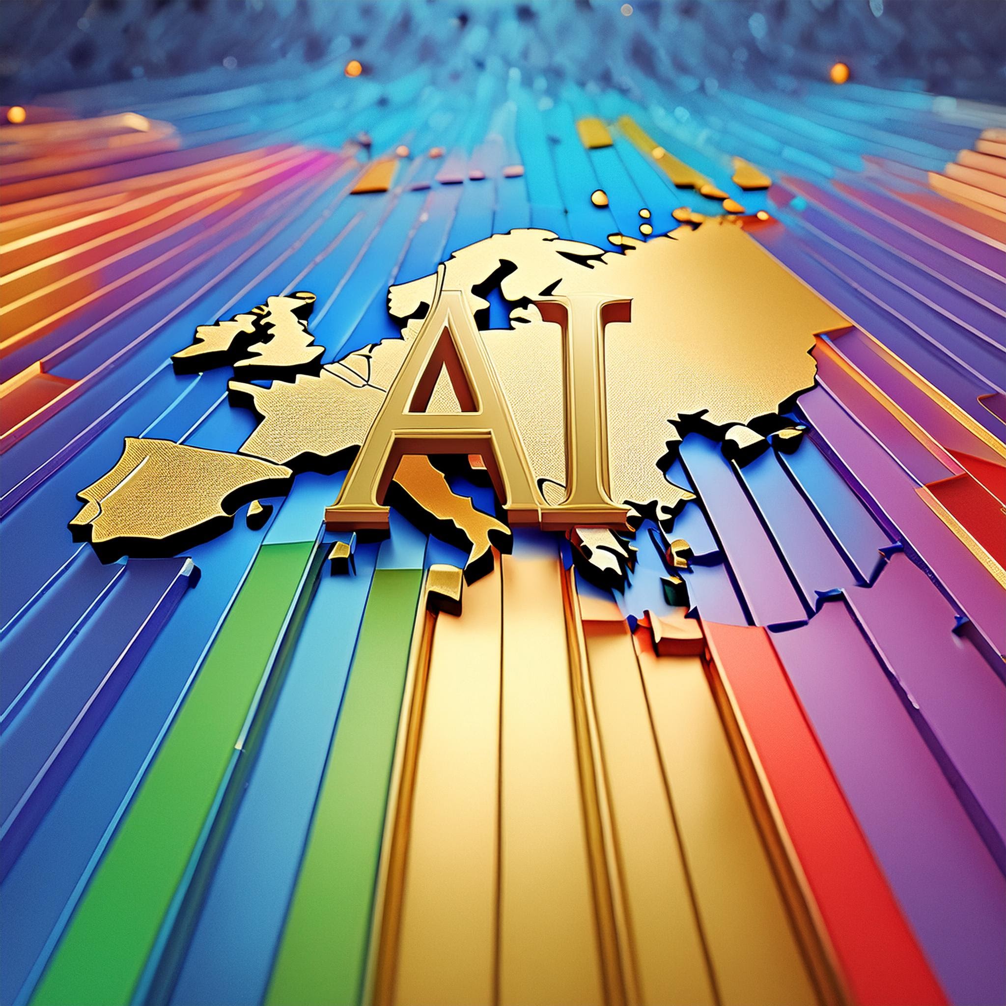
So far, we have had the launch of several large language models (LLMs) such as Chat GPT and a number of image models such as Dall-E and Midjourney. The map below was actually generated by Adobe Creative Cloud / Firefly for Education, which I have access to via school.
The prompt was: "A map of Europe, with the letters A and I hovering over it in gold with rainbow edges".

Quite a few people have shared how they use prompts to elicit certain outcomes from LLMs in a geography context. But should we be using it in our teaching and if so, what disclaimers should we display when we have used it?
One ethical issue for me that should be considered is that of plagiarism, and the use of authors' works to 'train' the models without their permission. Using AI isn't developing students' geographical knowledge or imagination.
There are also issues with image generation. Models can't handle the fine detail of letters and other graphical content, or the fine details such as how many fingers on a person is too many.
There are some early map creators that have been developed and made free of charge. One is called PROXI, but doesn't seem to do a great deal that a simple tool like ArcGIS Online could do with a few clicks anyway.
Here's an output: a map of second hand book shops in Iceland - I made a map of Iceland to test it out.
A lot of coverage of this story this week, not all of it positive.


A new resource from the National Archives.
This is perfect for our unit on 'Windrush Child'.
We’re excited to launch our new resource, Mapping Caribbean Migration to Britain.
— The National Archives (@UkNatArchives) October 20, 2023
This resource traces passenger journey’s on three post-war ships, the Ormonde, Almanzora, and Empire Windrush, through a series of interactive maps.
Discover more: https://t.co/qSogHFuT4N#BHM

The Arctic and Antarctic are changing so rapidly that the maps need updating regularly. This work is completed by the British Antarctic Survey. I have one of their maps for my department, but perhaps need the latest now to replace it (or for comparison).
Today our cartographers released new Antarctic and Arctic maps - with lots of changes to these fast changing and fragile places:
— British Antarctic Survey 🐧 (@BAS_News) June 8, 2023
🧊 ice sheet loss
🌊 new sea ice data
📌 using indigenous town names in the Canadian Arctic#WorldOceansDay #climatechangehttps://t.co/GNfe2F5BEF
The BAS have just released some new maps.


Thanks to Ahmad Barclay for the heads-up (once again) on ONS data and map releases from the Census 2021.

📈Big new data release today on #CensusMaps!📉
— Ahmad Barclay (@bothness) March 7, 2023
See how your area has changed over the past 10 years, right down to a neighbourhood levelhttps://t.co/mIj0ahCHBd
1/3 pic.twitter.com/RiBEdwmq9E
These maps are going to be very helpful for a lot of teachers and students.
I put a quick guide together which you are welcome to use / download / distribute:
Following our work on 'Windrush Child', the new Census 2021 maps from ONS may help answer that question:

Enter a postcode to see which changes have occurred in your local area.

There is also a useful summary showing the changing fortunes of certain shops and services.
The data has been collected by the Ordnance Survey.
Ely High Street mirrors some of these changes to some extent.

I've previously shared a link during the heat of earlier in the week, which may well return before summer is out.
This BBC article looks at people living in the hottest parts of the country.
This is defined by a data set which is called the Heat Hazard Score.
This could make a useful secondary data set for an NEA.
I will also refer to this when we start back for the new academic year.
Enter a postcode to get a score. I put in my school postcode first, and got a score of 2.


Use Google Street View to explore locations which have a score of 4 or 5 to see what their characteristics are.
Also explore the impacts of heat on transport with this ESRI StoryMap made by the UK team along with the Met Office.
Last week I had a meeting of the GI Pedagogy group of partners - which is funded by an ERASMUS+ grant, given by the British Council.
I represent King's Ely on this project, and have completed all the intellectual outputs and supported other partners and worked on a range of work packages.

We have been working on resources and an online teacher training course.
We now have an opportunity for you to join us for a face to face event in Madrid.
Free training course for secondary teachers - introducing an Innovative Pedagogical Model for Teaching using GIS, July 4-6 2022, Madrid, @GIPedagogy project, some travel grants available - find out more and register at https://t.co/8uy2lRNfpA
— karl_donert (@karldonert) May 19, 2022
The Registration form is here, and you can also request a first-come first-served grant of €200 to help with the cost of attending if you are outside of Spain.
It would be great to have you there. Happy to answer any further questions as well.


I've just sorted a PRO subscription to the GeoGuessr site for the department. Several students requested it a while back.
I used to play this when it first came out in 2013. It was developed by Anton Wallén, and was originally free, but has moved to a subscription based model and now has a thriving community and a whole range of boards and challenges, including trying to identify countries in a streak as well as a daily challenge.
There is also the option to create your own map using the Map Maker tool.
There are lots of sites giving tips on how to identify countries from a range of clues.
It also makes use of Google Street View, which doesn't cover the whole world of course. A map of the coverage is here.

This article looks at the value of playing the game, particularly during lockdown.
There are some very sophisticated groups out there such as GeoTips, who have their own Discord server for keeping track of activity and World Record attempts.
There are also Twitch streamers who play the game live, perhaps in Battle Royale mode, where you compete against other players to identify locations the soonest.
Any other GeoGuessr tips and ideas welcome.

Need an Atlas but not got one in the house?
Check out the digital atlases.


